It’s the first thing that people see when visiting your Facebook Page, yet I still see businesses not using this feature to it’s full potential.
What do I mean by full potential? Well, it’s just like when creating a landing page, the first thing that people see is the headline, so it’s essential that your headline is clear and attention grabbing.
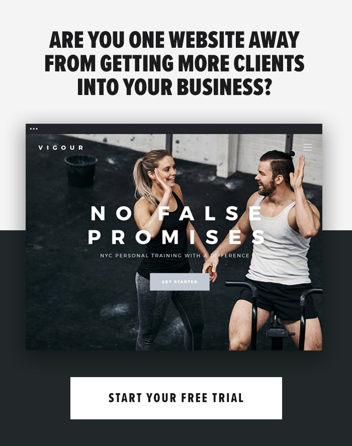
Your Facebook cover photo is exactly the same.
Whether you’re using Facebook to generate leads, close your next sale, or just create a hub for your clients, knowing how to make and optimise your cover photo is very important.
In this article, I’m going to cover the do’s and dont’s of Facebook cover photos and by the end of this article, you should have all the knowledge and resources to create one that maximises your business.
==
The Dont’s

Don’t just throw in any ol’ image.
It’s one of my biggest pet-hates – seeing a Facebook page with a random image as the cover photo. Maybe it’s a picture that the Facebook Page owner likes, either that or they just googled a vague term and chose the first image they could find.
What does this say to me, as a Facebook user? Nothing. It doesn’t tell me what the page is for, what content they provide, nor does it promote anything to me…it’s just an image.
See, the problem here is that some page owners mistake the cover photo as, like a wallpaper for their page. It’s not a wallpaper, you need to see it as a larger banner ad that you can promote on…for free! Use it to it’s full potential.

Don’t overcrowd your cover photo
Simplicity really is key for cover photos. Too much information in the image will make users avoid it like the plague.
You want to stick with one focal point in your cover photo. If you have a number of promotions (eBooks etc.) only promote one in your cover photo – you can always alternate it every week or so.
I also recommend keeping your wording simple too. Try sticking with one headline. If you need to add more, try using bullet points. People will only look at your cover photo for a short amount of time, so information overload will kill conversions.

Don’t use pixelated images
Nothing says ‘shabby job’ online like a pixelated blurred image. It’s 2017, we shouldn’t be seeing pixelated images in marketing anymore, and this goes for your cover photo, too.
When users see a pixelated cover photo, many warning signs run through their mind; this page isn’t up to date, the business isn’t tech-savvy, or they just simply aren’t professional.
Quite damaging thoughts from just a pixelated image, right? But this is what happens.
Let’s say you were browsing online and saw one of the bigger brands using pixelated photos – you’d be confused and all the above thoughts will run through your mind.
This is exactly what users will think if you use pixelated photos, too.
Keep your images crystal clear. The best way to do this is by using high quality photos and sticking with Facebook’s recommend dimensions (which we will talk about in the Do’s section)

Don’t use bad grammar
This pretty much goes for all of your marketing, but I do recommend paying close attention to large banners like your cover photo.
With your cover photo being the first thing page visitors will see, and the fact that it’s so large, perfect grammar is a must. The last thing you want is a grammatical error as it will completely destroy the message you’re trying to portray.
So take your time writing your text. Try to keep it short and snappy and then have an outside eye, maybe a friend or colleague take a look to ensure you haven’t missed anything.
—
The Do’s

Do stick to the recommended dimensions
As mentioned in the earlier ‘dont’ talking about pixelated images, sticking with Facebook’s recommend cover dimensions is essential to ensure your image looks crisp and clear.
Not only will the dimensions do this, it will also help avoid any important sections being cut off, too.
Facebook’s recommend dimensions are: 828 x 315 pixels.

Do add an arrow to your call-to-action
One of the neatest features that has been added is the new call-to-action button (as shown below)
This button helps give your visitors a way of becoming leads straight from your Facebook page.
A great way of maximising your leads through your page is by using your cover photo as a call-to-action banner and then pointing the focus towards your call-to-action button.
This will help draw people’s attention to the most important part – the button. This is what we need users to click after all.
Do abide by Facebook’s cover photo guidelines.
There are a few things to keep in mind when it comes to imagery on Facebook. For a detailed overview I’d highly suggest reading through the full Page Guidelines, but here are a few important things to keep in mind for your cover photo:
- Your cover is public.
- Covers can’t be deceptive, misleading, or infringe on anyone else’s copyright.
- You can’t encourage people to upload your cover to their personal timelines.
If you get caught violating the above terms, Facebook could take action against your Page. And while Facebook doesn’t explicitly say what will happen if you violate their Page guidelines, it’s probably not smart to get your Facebook Page taken down over a cover photo infraction, so read the guidelines in full and adhere to them.

Do include a shortened link in your cover photo description.
To add some extra punch to your CTAs, I recommend adding a caption to your cover photo, which will feature the same call-to-action link as your button. This way, any time people view your cover photo directly, they can access the download link.
===
Share your Facebook page link in the comment section below and I’ll be happy to advise you on further tips for your cover photo.